

3.4 Bar charts: Surgical removal of tattoos
Figure 4 shows a bar chart for the data in Table 7 on the effectiveness of tattoo removal.
For the data on nuclear power stations, the order of the categories did not matter. However, sometimes order is important. The quality of tattoo removal was given a score from 1 to 4, and this ordering has been preserved along the quality (horizontal) axis. The vertical axis shows the reported frequency for each assessment.
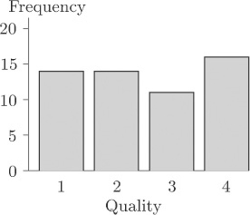
Figure 4 Quality assessment of surgical removal of 55 tattoos
The eye is good at assessing lengths, whereas comparison of areas or angles does not come so naturally. Thus an advantage of bar charts over pie charts is that it is much easier to be accurate when comparing frequencies from a bar chart than from a pie chart.