
4.3 Scatterplots: body weights and brain weights for animals
In our discussion of the data on body weights and brain weights for animals in section 1.7, we conjectured a strong relationship between these weights on the grounds that a large body might well need a large brain to run it properly. At that stage a ‘difficulty’ with the data was also suggested, but we did not say exactly what it was. It would, you might reasonably have thought, be useful to look at a scatterplot, but you will see the difficulty if you actually try to produce one. Did you spot the problem when it was first mentioned in section 1.7? There are many very small weights such as those for the hamster and the mouse which simply do not show up properly if displayed on the same plot as, say, those for animals like the elephant! Figure 15 shows the difficulty very clearly.
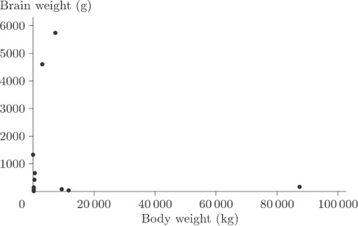
You cannot see anything from this scatterplot. The many very small weights are all lumped together in order to allow a sufficient spread on the scale to include the heavy ones on the plot. As it stands, the plot is pretty well useless.
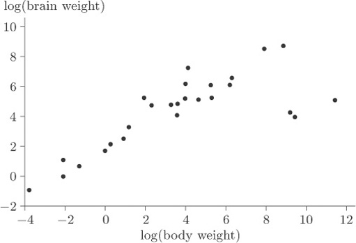
Now, this sort of thing often happens and the usual way of getting round the problem is to transform the data in such a way as to spread out the points with very small values of either variable, and to pull closer together the points with very large values for either variable. The objective is to reduce the spread in the large values relative to the spread in the small values. In this case it can be done by plotting the logarithm of brain weight against the logarithm of body weight. The log transformation compresses the large values but stretches the small ones. (Notice that simply treating the large values as outliers and removing them would not solve the problem because the tight clumping of points close to the origin would still remain to some extent. Also, there are in this case several possible outliers, and in general it is not good practice simply to throw data out of an analysis without at least considering potential reasons why these points should not be considered along with all the rest.)
Figure 16 shows the scatterplot that is obtained after applying a log transformation to both variables.
Activity 6: Interpreting a scatterplot
What information does Figure 16 give about the relationship between body weight and brain weight? Are there any points that you might consider as outliers?
Discussion
The plot immediately reveals three apparent outliers to the right of the main band of points. Excluding these three species, there is a convincing linear relationship, although there are two or three points that are slightly above the general pattern of the others and hence appear to have high brain weight to body weight ratios.
When you discover the animals to which the three ‘obvious’ outlying points correspond you will not be surprised. One way of identifying them is by labelling all the animals with the first letters of the names of their species and plotting the letters in place of the points. The resulting scatterplot is shown in Figure 17.
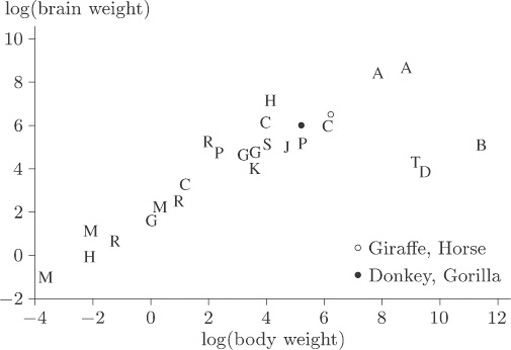
A comparison of the letters with the values in Table 6 shows that the three outliers, labelled B, D and T, correspond to the dinosaurs Brachiosaurus, Diplodocus and Triceratops. The human, mole and Rhesus monkey all appear to have rather high brain weight in relation to body weight, but they are by no means as extreme compared to the general pattern as are the three dinosaur species.