

5.10 Symmetry and skewness
For many purposes the location and dispersion of a set of data are the main features of its distribution that we might wish to summarise, numerically or otherwise. But for some purposes it can be important to consider a slightly more subtle aspect: the symmetry, or lack of symmetry, in the data.
Example 4: Family sizes of Protestant mothers in Ontario
The following data are taken from the 1941 Canadian Census and comprise the sizes of completed families (numbers of children) born to a sample of Protestant mothers in Ontario aged 45–54 and married at age 15–19. The data are split into two groups according to how many years of formal education the mothers had received.
| Mother educated for six years or less |
| 14 13 4 14 10 2 13 5 0 0 13 3 9 2 10 11 13 5 14 |
| Mother educated for seven years or more |
| 0 4 0 2 3 3 0 4 7 1 9 4 3 2 32 16 6 0 13 6 6 5 9 10 5 4 3 3 5 2 3 5 15 5 |
(Keyfitz, N. (1953) A factorial arrangement of comparisons of family size. American J. Sociology, 53, 470–480.)
Figure 21 shows a bar chart of some of the data from Table 12: it shows the numbers of children born to the 35 mothers who had at least seven years of education.
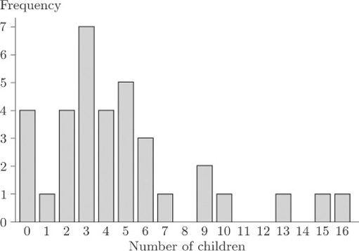
As you can see, the bar chart shows a marked lack of symmetry.
Exercise 1: Family size
For each of the two data sets in Table 12, calculate the range, the median, the upper and lower quartiles and the interquartile range.
Use the statistical functions of your calculator to find the mean, the standard deviation and the variance for each of the two data sets.
Answer
Solution
After sorting into order of increasing size, the two data sets are as follows.
| Mother educated for six years or less |
| 0 0 2 2 3 4 5 5 9 10 10 11 13 13 13 13 14 14 14 |
| Mother educated for seven years or more |
| 0 0 0 0 1 2 2 2 2 3 3 3 3 3 3 3 4 4 4 4 5 5 5 5 5 6 6 6 7 9 9 10 13 15 16 |
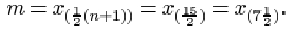
For the mothers with at most six years of education, the sample size n is 19. The range is just the difference between the largest and the smallest values in the sample, so it is 14−0=14. The median is

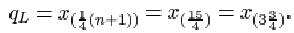
The lower quartile is
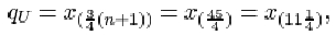
The upper quartile is

Thus the interquartile range is
For the other data set, the sample size n is 35. The range is 16−0=16. The median is
The lower quartile is

The upper quartile is
The interquartile range is
The mean and the standard deviation for the first sample are respectively 8.158 and 5.188, or approximately 8.2 and 5.2. The variance is the square of the standard deviation, 5.1882 = 26.9 (approx.). For the second sample, the mean, standard deviation and variance are respectively 4.8, 3.954 = 4.0 (approx.) and 3.9542 = 15.6 (approx.).
Detection of lack of symmetry is of considerable importance in data analysis and inference. One reason is that the most important summary measure of the data is the typical or central value in the context of which the sample median and the sample mean were introduced. When the data are roughly symmetrically distributed, all ambiguity is removed because the median and the mean will nearly coincide. However, when the data are very far from symmetrical, not only will these measures not coincide but we may even be pressed to decide whether any summary measure of this kind is appropriate. There are other reasons for the importance of symmetry in data analysis. For instance, most statistical methods involve producing a mathematical (probability) model for data, and the choice of an appropriate model may depend on whether the data are symmetrical.
Numerical data that are not symmetrical, in the sense that a bar chart or histogram shows clear lack of symmetry, are said to be skew or skewed. In Figure 21, the general pattern of lack of symmetry is that the main bulk of the data take relatively low values, towards the left of the bar chart, and to the right of the bar chart there is a relatively large ‘tail’ of relatively high values. Because of this ‘tail’ to the right, data showing this sort of pattern are said to be right-skew or positively skewed.
These data on family sizes arise from counts, so they are discrete, and a bar chart is an appropriate way to picture them. But the concept of skewness applies also to measured (continuous) data. Figure 22 shows a histogram of the time intervals (in seconds) between pulses along a nerve fibre.
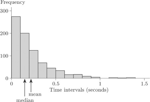
Again, the general pattern is one of lack of symmetry. The data have a relatively large ‘tail’ to the right of the diagram for relatively long time intervals, so again they are described as right-skew or positively skewed.
The mean and the median are shown in Figure 22. Notice that the mean is greater than the median; this is the case for right-skew data in general.
Clearly not all data sets that exhibit lack of symmetry are right-skew. Data sets whose bar charts or histograms look generally like the mirror images of Figures 21 and 22 are said to be left-skew or negatively skewed. In general, the mean is less than the median for left-skew data. (Note that the direction – left or right – used to describe the skewness is the direction in which the long ‘tail’ of the distribution points, not the end of the diagram where the main bulk of the data lie.) In practice, right-skew data are relatively common, and often arise (as in the data sets in Figures 21 and 22) where there is some natural lower limit on the values of a variable, so that it is impossible for there to be a long ‘tail’ to the left. In the nature of things, natural upper limits on the values of variables tend to be less common, so that left-skew data are encountered rather less frequently.
Figure 23 is a bar chart of the family sizes of the first group of mothers in Table 12, who were educated for six years or less.
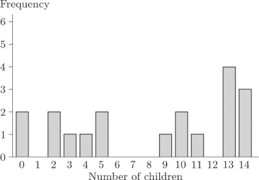
This bar chart does not exhibit such a clear lack of symmetry as does Figure 21; but it is not symmetrical. This time, however, the main concentration of the data is, if anything, towards the right of the diagram and the main ‘tail’ is to the left. These data are left-skew, or negatively skewed.
As well as a general impression of skewness obtained by looking at histograms or bar charts, a numerical measure of symmetry is both meaningful and useful.
The generally accepted measure is the sample skewness, defined as follows.
The sample skewness
The sample skewness of a data sample x 1, x 2, …, xn is given by
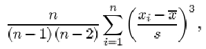
where ![]() is the sample mean and s is the sample standard deviation.
is the sample mean and s is the sample standard deviation.
Notice the term ![]() in this formula. Since
in this formula. Since ![]() is positive when
is positive when ![]() is positive and negative when
is positive and negative when ![]() is negative, observations greater than the sample mean contribute positive terms to the sum, while observations less than the sample mean contribute negative terms. Perfectly symmetric data have a skewness of 0, because the contributions from positive and negative terms cancel out. In skewed data, the sign of the sample skewness depends on the direction of the skew. For right-skew data, the bigger ‘tail’ is on the right, so that it consists (largely at any rate) of values greater than the sample mean. In other words, in right-skew data there are a lot of values much greater than the sample mean, and fewer values much less than the sample mean. The power of 3 applied to the terms in the sum, in the formula for sample skewness, means that values a long way from the mean contribute a disproportionately large amount to the sum. Thus, in right-skew data, the positive terms in the sum outweigh the negative terms, and the sample skewness comes out to be positive. In left-skew data, it is the other way round and the sample skewness is negative. (This, in a sense, is the reason why right-skew data are also said to be positively skewed, and left-skew data are negatively skewed.) The data of Figure 21 have a sample skewness of 1.36, and those in Figure 23 have a sample skewness of −0.33. That is, the data for the group of mothers with seven or more years of education have positive skewness, while for the group of mothers with six or less years of education, the sample skewness is negative. The asymmetry is rather slight for the second group of mothers, certainly by comparison to the first group of mothers.
is negative, observations greater than the sample mean contribute positive terms to the sum, while observations less than the sample mean contribute negative terms. Perfectly symmetric data have a skewness of 0, because the contributions from positive and negative terms cancel out. In skewed data, the sign of the sample skewness depends on the direction of the skew. For right-skew data, the bigger ‘tail’ is on the right, so that it consists (largely at any rate) of values greater than the sample mean. In other words, in right-skew data there are a lot of values much greater than the sample mean, and fewer values much less than the sample mean. The power of 3 applied to the terms in the sum, in the formula for sample skewness, means that values a long way from the mean contribute a disproportionately large amount to the sum. Thus, in right-skew data, the positive terms in the sum outweigh the negative terms, and the sample skewness comes out to be positive. In left-skew data, it is the other way round and the sample skewness is negative. (This, in a sense, is the reason why right-skew data are also said to be positively skewed, and left-skew data are negatively skewed.) The data of Figure 21 have a sample skewness of 1.36, and those in Figure 23 have a sample skewness of −0.33. That is, the data for the group of mothers with seven or more years of education have positive skewness, while for the group of mothers with six or less years of education, the sample skewness is negative. The asymmetry is rather slight for the second group of mothers, certainly by comparison to the first group of mothers.
It is, of course, possible to calculate the sample skewness on a calculator, but the computations are rather tedious. In practice a statistician would use a computer — and therefore practice on calculating skewness is left to the computer book.
Exercise 2 Alcohol consumption
Table 5 contains average annual alcohol consumption figures (in 1/person) for 15 countries. The figure for France was observed to be much higher than the other figures (an apparent outlier). In order of increasing size, the other values in the data set are as follows.
| 3.1 | 3.9 | 4.2 | 5.6 | 5.7 | 5.8 | 6.6 | 7.2 | 8.3 | 9.9 | 10.8 | 10.9 | 12.3 | 15.2 |
Calculate the median, the upper and lower quartiles and the interquartile range for these alcohol consumption figures.
Answer
Solution
For these data, the sample size n is 14. The lower quartile is
This is three-quarters of the way between x (3) =4.2 and x (4)=5.6. So
qL = 4.2 + ¾(5.6 – 4.2) = 5.25,
or approximately 5.3. The sample median is
This is midway between x (6)=6.6 and x (8)=7.2, that is 6.9.
The upper quartile is
which is one-quarter of the way between x (11)=10.8 and x (12)=10.9. So
qU = 10.8 + ¼(10.9 – 10.8) = 10.825,
or approximately 10.8. The interquartile range is
qU – qL = 10.825 – 5.25 = 5.575,
or approximately 5.6.