1 Working with data
Pause for thought Think about the many ways there are of using diagrams to represent data. List a few of the ones that you have seen recently. Look in some newspapers, or if you have access to the internet explore some news reports online. What types of diagrams can you find? Look carefully at these diagrams. What information do they claim to be giving you? Do they actually show what they are said to show, or are there some subtle (or none too subtle) ways in which the diagrams have been manipulated to enhance their message? Keep these diagrams – they can be used for an activity later. |
The use of data is increasing, not just throughout India but also the rest of the world. This is almost certainly due to the increasing availability of computers and electronic means of collecting, organising and storing data. Data conveys information, which can be numeric (quantitative) or descriptive (qualitative). Since this unit is about mathematics, most of the data represented here will be numeric.
Lots of numeric data could be collected in schools: the number of students attending each day, the number of classes, the number of classrooms or the number of teachers. You can probably think of more. If these numbers are just kept in a book and not ordered or represented in any way, then any messages they might be able to provide will be lost.
So data is presented in such a way that it enables the person interrogating it to understand something about the world and the way it works. If the population of a country is continually rising but the amount of food produced stays static, then more food will need to be imported. A graphical representation may get this point across clearly.
Data is ordered and represented in many ways, for example by using:
- tables
- pictograms
- bar charts
- histograms
- pie charts
- line graphs.
Each type of diagram has its own rules and conventions. In mathematics, examples are:
- striking through bundles of five tally marks
- the independent variable goes along the horizontal x-axis
- the dependent variable is shown using the vertical y-axis
- the spaces between the markings on each axis must be equal.
Some of these rules and conventions are more important than others.
Activity 1 uses the students themselves to form bar charts, so that they begin to think what the data represented by bar charts really means.
Before attempting to use the activities in this unit with your students, it would be a good idea to complete all, or at least part, of the activities yourself. It would be even better if you could try them out with a colleague, because that will help you when you reflect on the experience. Trying them for yourself will mean you get insights into learners’ experiences which can, in turn, influence your teaching and your experiences as a teacher.
Activity 1: Representing your own data
Part 1: Constructing bar charts
Preparation
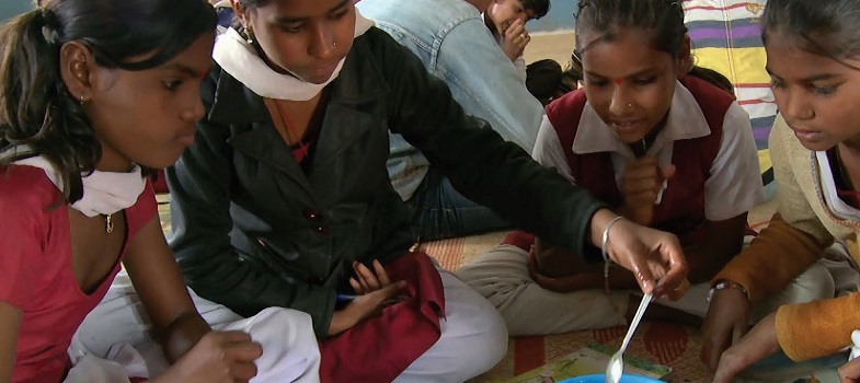
Your students will need a lot of space for this activity, so it will be a good idea to go outside or to an assembly room (Figure 1).

When taking students to work in the school grounds you should always make sure your students are aware of safety hazards they might encounter such as moving vehicles or building works, and prepare for changes in the weather.
You will need to find some surface that can be used for drawing axes. The corners of a building will work, especially if you can use chalk on the walls to show the markings on an axis. If you have access to an area of paving stones this would be useful, but it is not essential.
The activity
- Tell the students they are going to make a bar chart showing the number of sisters that students in their class have.
- Ask the students how many sisters they each have.
- Ask all those who have no sisters to make a straight line going out from where you decide zero will be.
- Then ask the students who have one sister to make a line next to the zero line, but not touching it. Make sure that they stand the same distance apart in their line as those with no sisters. Ask the students why they should do this.
- Continue with two sisters, three sisters and so on. Leave a space where there are gaps in the number of sisters. There may be those with four sisters but not five and then perhaps some with six.
- Either ask the students what sort of chart they have formed, or tell them that they have formed a bar chart.
- Now ask some questions, such as: How many people have three sisters? How many do not have sisters? What is the most popular number of sisters (the mode)? What would be an efficient way of working out how many sisters the whole class has?
- Divide the class into groups of about 10 students. Ask them to make their own bar chart. They could choose a subject of their own or one from a given list. Ideas could be: the number of people who prefer certain Bollywood stars, or what they like to eat for lunch, or how many drinks they have in a day. When they have made their bar chart ask them to call you over to see it and then ask them similar questions to the ones above.
- To conclude the task, ask each group to show their bar chart to the rest of the class. Encourage students to ask the group questions about their chart.
Part 2: Constructing pie charts
Preparation
Pie charts can be constructed in much the same way, but they need a little more organisation. You will need pieces of paper, a long length of string or cord, and a pair of scissors.
Use about 20 students to start with.
The activity
- Ask each student to pick their favourite choice from a given category: types of breakfast dish (for example, sandwich, idli, poha, paratha or upama) or types of fruit. Four or five categories will work best for a pie chart.
- Instruct the students to draw or write their choice on their piece of paper.
- Gather those who have made the same choice together to hold hands in a chain, then ask all of the students to join hands to make a circle.
- Use the string to go from the centre of the circle to mark the divisions between the categories, thereby making a pie chart.
- Now ask them to decide which is the most popular category. That is, which sector of the circle contains the most students? Explain that this is called the ‘mode’.
- Ask more questions, such as how could you tell which was the biggest from two similar sectors if you could only see the pie chart and not the students.
Video: Involving all |
Case Study 1: Mrs Chakrakodi reflects on using Activity 1
This is the account of a teacher who tried Activity 1 with her elementary students.
I tried the first activity with Class VI. They loved the idea of forming the bar charts. In our class we had no students with four sisters and only one student with five sisters. The number with one sister was the most popular and very few students had three sisters.
They could all answer the questions put to them very easily. So when the next part was being done there were a lot of suggestions in the various groups about the different bar charts they could make. One group said they would count the numbers of brothers and sisters each student had and make a graph for that. Another group said they would ask the students how many graduates they had in each of their families.
Yet another group came up with saying that they would find how many glasses of water each student drank in a day. Mona objected, saying she doesn’t always drink using a glass but the group leader Dinesh countered this by saying ‘We are going to ask them for an estimate in terms of glasses of water’.
I did the pie chart activity with Class VIII. I asked them that if they were given the option of choosing their favourite breakfast dish out of the following five choices, what would they opt for: sandwich, idli, poha, paratha or upama? I asked Mita and Neha to come forward to put tally marks in the columns I had made for each one of them as they went through all the students to make their choice. Mita also made each one of them stand up and join a group with the same favourites. This way they could verify the number Neha had put up in the tally mark.
They were then very taken up with the way the circle was made with the groups remaining together. And some could at once guess which was going to be the biggest section.
We then had a big discussion about how the sectors were to the whole circle as the arc of that part was to the circumference, also how the central angle of that sector was to the whole central angle. Some were not so convinced about that so we then tried representing it on paper and seeing whether that really was the case. But I was happy with the discussion that took place. I am sure that quite a bit of what we discussed would become permanent learning for most of the students.
Reflecting on your teaching practice
When you do such an exercise with your class, reflect afterwards on what went well and what went less well. Consider the questions that led to the students being interested and being able to progress, and those you needed to clarify. Such reflection always helps with finding a ‘script’ that helps you engage the students to find mathematics interesting and enjoyable. If they do not understand and cannot do something, they are less likely to become involved. Use this reflective exercise every time you undertake the activities, noting, as Mrs Chakrakodi, did some quite small things that made a difference.
Pause for thought Good questions to trigger such reflection are:
|
What you can learn in this unit